Accessibility essentials every front-end developer should know

Many developers view accessibility as an overwhelming task, requiring a lot of extra effort or specialized knowledge. But a few basic practices can make a significant impact.
In this article, I'll walk you through the key accessibility principles I believe every front-end developer should apply when building components, including:
- Semantic HTML: Use the right elements for interactive and native functionality.
- Forms: Simplify labels and structure to improve usability for everyone.
- Keyboard navigation: Ensure users can navigate around with their keyboard.
- Modals: Modals have many accessibility requirements.
- Image alt texts: Write better descriptions to make images more accessible.
- Styling: Enhance accessibility through focus indicators, responsive design, and reduced motion.
- ARIA Attributes: When and how to use ARIA to fill accessibility gaps.
These practices not only benefit users relying on assistive technologies, they improve the overall user experience (UX).
This article focuses on the basic things you, as a front-end developer, can do to improve accessibility and usability without spending much extra time and effort.
Most examples in this article use React, but the principles apply to any front-end app. Even if you're not using React, you can still benefit from the practices outlined here.
Semantic HTML
Accessibility begins with semantic HTML; using the correct HTML5 elements for their intended purposes. This helps browsers and tools understand the structure of your page allowing them to provide built-in accessibility benefits. And a nice bonus is that semantic HTML also improves SEO.
Interactive elements
The most important elements to get right are <button> and <a>. These have accessibility features built-in by default, which includes keyboard support (the behavior of which can differ per operating system) and providing semantic meaning to screen readers.
A common anti-pattern in (web) applications are divs with onClick handlers. Never use a <div> with an onClick handler as the only way to make an element interactive. These elements lack accessibility features, which limits the way users can interact with them while making it impossible for screen readers. Moreover, properly using <button> and <a> for interactive elements benefits all users:
- Links allow users to right-click for a context menu with various actions, or to open it in a new tab by control-clicking it on Windows, command-clicking it on Mac, or by clicking it with the middle-mouse button.
- Buttons enable users to navigate through your site with their keyboard. This allows power users to speed up their workflows, and is essential for assistive technologies.
If you need custom styling, you can fully restyle a <button> or <a> without sacrificing accessibility. More on styling buttons and links later.
Native elements
Beyond buttons and links, native elements like <select>, <input>, and <textarea> are accessible out of the box. A <select> dropdown, for example, works seamlessly with screen readers and keyboard navigation, providing a consistent user experience without extra work.
While it's tempting to build your own custom components for aesthetic or functional reasons, building accessible replacements for native elements is very difficult and time-consuming. Even though I'm typically not a fan of installing libraries for small problems (as I've written about in my articles on dependencies), in this case it's better to rely on widely-used and mature libraries that already have accessibility covered, like react-select.
Forms
One thing I repeatedly find in projects that I join, is form fields not contained in a <form>.
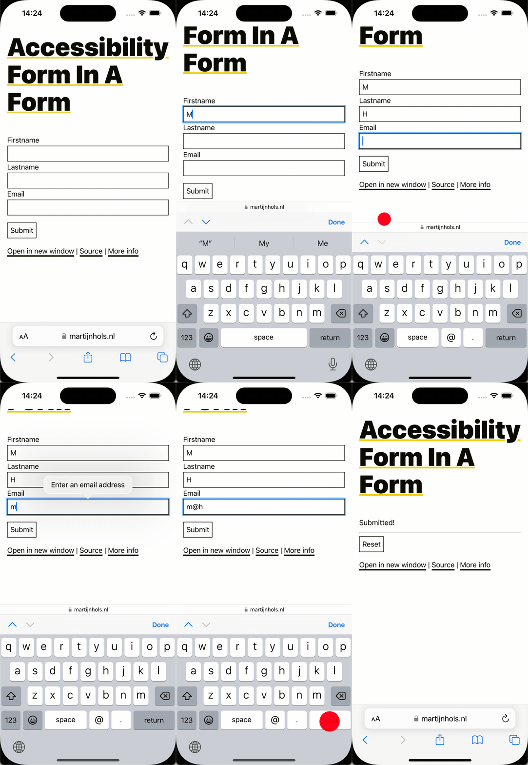
Every form field should be contained in a <form> with an onSubmit handler and a submit button. This enables browsers and screen readers to identify related fields and provides accessibility and usability benefits, such as allowing users to submit with the Enter key and, on mobile, jumping from field to field within the form without having to close the on-screen keyboard.


Labels
Every input field must have a clear label describing its purpose. Labels should be linked to the input field by making the for attribute (htmlFor in React) refer to the id of the input field:
<label for="email">Email:</label><input type="email" id="email" />
Although it's valid HTML to implicitly link the label and input by omitting the for attribute and wrapping them together in a <label> element, implicit association is not supported by all voice control software. To ensure good support across all assistive technologies, it's best to always use the for attribute.
In React, I'm not a fan of hard-coded ids as components are meant to be easily reusable and may be rendered multiple times on the same page. To avoid id conflicts, you can use React's useId hook to generate unique ids for each field. See Generating IDs for several related elements for an example of how to do this in forms.
Placeholders
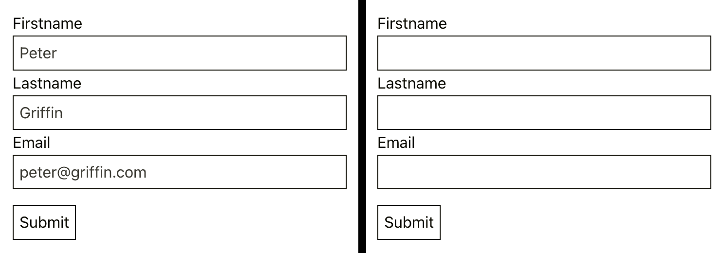
Placeholders are not substitutes for labels. They disappear when users start typing, which can leave users confused about what the field is for. They're also often harder to read due to their low contrast. Additionally, placeholders make it harder to identify which fields have not yet been filled, as shown in the image below.

Always use a proper <label> and try to use placeholders sparingly.
Keyboard navigation
The keyboard is an essential alternative tool to navigating with a mouse. Make sure users can navigate your app logically with the Tab key and trigger actions with Enter. Using native HTML elements like <button> and <a> plays a significant role in making this seamless.
Focus indicators
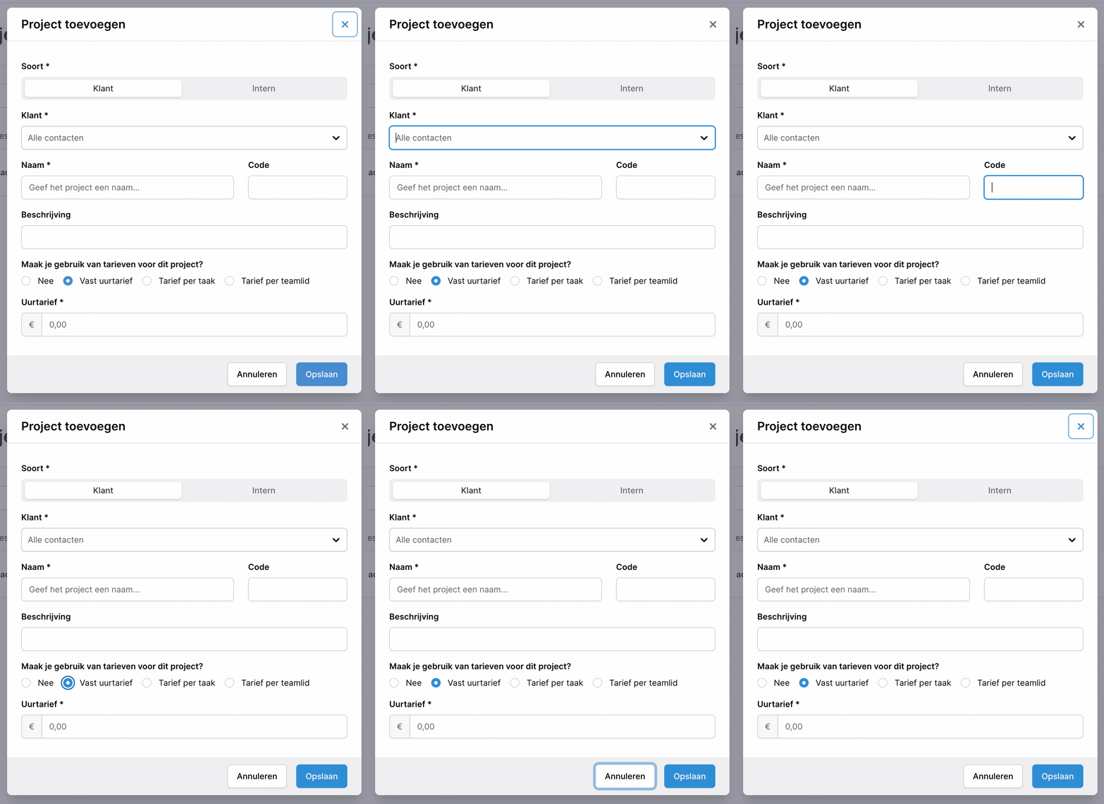
Focus indicators are essential for keyboard navigation. Never disable focus indicators completely. The :focus-visible selector, rather than :focus, allows you to show focus indicators only when browsers deem it relevant to the user. This provides a solution to the old complaints that focus rings are visually ugly without sacrificing accessibility.

The GIF above has a custom field for the "Soort" (type) field. It's fully accessible, as it's built with radio buttons and CSS. The radio buttons are visually hidden but fully accessible; they can still be selected and are announced by screen readers. This highlights the power of using semantic HTML as much as possible.
Modals
Modals are common in larger web applications but it can be challenging to make modals accessible. The key challenges to consider are focus management, keyboard navigation, and ensuring inactive content is hidden.
The easiest way to make modals accessible is again by using the power of semantic HTML; use the <dialog> element. This element now has solid browser support and addresses most accessibility concerns with modals, including keyboard navigation.
Custom modals
If you're building a custom modal without <dialog>, there are many accessibility factors to account for. Modals are tricky to get right, and creating a fully accessible one from scratch is a significant challenge. Covering all the details would take an entire article, but here are some key points to consider:
Focus management
When a modal opens, the user's focus remains on the button that opened the modal, making it difficult for users to interact with the newly opened modal. This can also lead to users accidentally opening multiple instances of the same modal.
To address this:
- Set the focus to the modal as soon as it opens.
- Implement a focus trap to keep the focus within the modal so users cannot tab to the underlying page.
- Return focus to the triggering element when the modal closes.
A library like react-focus-lock provides good solutions for this. It handles the initial focus, traps the focus so it cycles only through active elements within the modal, and can restore focus to the triggering element when the modal closes using its returnFocus option.
For confirmation dialogs, consider settings the initial focus to the "Confirm" button. This allows users to immediately confirm an action by pressing Enter, just like in native dialogs.
Inactive content
When a modal opens, the content behind it is usually blocked visually by a backdrop. However, users, especially those using screen readers, may still be able to interact with the underlying content.
To prevent this, add the inert attribute to the content behind the modal. This makes the content non-interactive and hides it from assistive technologies.
To use inert in React, you need to portal your modal out of your main content. This ensures it falls outside of the inert scope, as inert applies to all children and cannot be disabled on child elements.
Closing modals
Users should be able to close modals with the Escape key. This is a common pattern that users expect that benefits users with mobility impairments and improves the overall user experience by providing a consistent way to dismiss modals.
Image alt texts
Alt texts are essential for making images accessible, and as a nice bonus, they improve SEO by helping search engines understand your content better.
You should add the alt attribute to images without exception. Use an empty alt text (alt="") only for images that are purely decorative or redundant to the text; this makes screen readers skip over images.
Writing alt texts
Writing good alt text is hard, and many guidelines on the internet are confusing. Over the years, I've developed a rule of thumb that works for me:
Imagine explaining the image to someone with poor vision. They can see some parts of the image, but can't make out everything. The alt text has to fill in the gaps of what they're seeing and not seeing.
A key takeaway from this approach is that if the image contains text, that text should always be included in the alt text. I find this approach leads me to add alt text to images more often than other guidelines would typically suggest.
I wrote a section called What is accessibility and who is it for? in my article on The European Accessibility Act that covers the different types of users that benefit from accessibility. It's worth a read if you're interested in learning more about the different types of users that benefit from accessibility.
Styling
Many aspects of styling (i.e. design) play a role in accessibility, such as:
- Focus indicators: Highlight the focused element with an outline (as covered earlier).
- Interactive elements: Ensure links look like links and buttons look like buttons, and they are easy to interact with.
- Interactivity feedback: provide clear hover, active and disabled states.
- Color contrast: Use sufficient contrast to distinguish elements.
- Colors: Pair colors with text or icons for users with color blindness.
- Responsive design: Support custom font sizes and zooming.
- Animations and motion: Reduce or disable motion for users sensitive to it.
- Font and spacing: Use clear fonts with adequate spacing, particularly for users with dyslexia.
Most of these are design-driven and fall outside of our direct influence. I'll focus on the areas where we can have the most direct impact.
Clickable areas
Ensure buttons and links have large, easily clickable areas for mouse and touch users. You can easily achieve this by adding padding to the element and, if necessary, using negative margins to make it appear visually equal.

Reduced motion
Animations can enhance usability by helping users maintain orientation on a page, such as when transitioning between states. However, some users have motion sensitivity and have opted for reduced motion in their OS settings. Respect this preference by disabling animations and transitions where applicable. This can be done with a simple media-query, such as:
@media (prefers-reduced-motion: reduce) { .modal { animation: none; }}
Accessible responsive design
One little-known fact is that browsers allow users to customize the default font size for web pages.
Accessible responsive design involves ensuring layouts adapt to the user's font size preference and the zoom levels they might use. Webpages should respect these preferences by using relative units like em and rem for font sizes, margins, text block widths and other layout values. Hardcoding these values in pixels should generally be avoided.
Applied to this blog
This blog uses relative sizing in most places (although it's far from perfect as it was a late addition). It doesn't set a base font size, using whatever is configured in the browser. From there, most other sizes are relative to that by using em values, and rem where necessary.
One example that really drove home the value of using em for non-text elements, is the width of this article text. I set it to 57em so that code blocks perfectly match the 80-character column width that I use in my IDE (plus it comes close to the ideal word count per line). Because the container scales with font size, the amount of words per line remains consistent regardless of the user-configured font size.
Using em for margins also makes a lot of sense, especially around text elements, as whitespace tends to grow with font size.
ARIA attributes
An article on accessibility wouldn't be complete without mentioning ARIA attributes, even if it's focused on things benefitting all users, not just those relying on screen readers.
While semantic HTML is a good starting point, ARIA attributes should only be used as a last resort when semantic elements can't achieve the desired result. Misusing ARIA can do more harm than good, so it's best to use them sparingly and thoughtfully.
The two most important ARIA attributes are:
aria-label
Adds an accessible label to elements that do not have visible text. For example, a search button with only an icon should include an aria-label clarifying it:
<button aria-label="Search"> <SearchIcon /></button>
While it can be used on any element, aria-label should only be used on interactive elements. It is not supported on non-interactive elements, and using it there can result in the label being ignored or causing confusing, unexpected, or annoying announcements.
aria-hidden
Hides elements from screen readers without removing them visually. This is ideal for decorative or redundant elements:
<div> React <ReactLogo aria-hidden /></div>
While these two attributes are a great starting point, there are many more ARIA attributes that you will need if you decide to go for full screen reader support. Some noteworthy ones are aria-live, aria-expanded, and aria-describedby, but it quickly becomes quite involved if you want to do it right.
Conclusion
These are the tools and principles that I reckon every front-end developer should use when building components. Accessibility isn't a separate task to tackle later, it's something that should be a part of your development process from the start.
As we've seen, most accessibility improvements don't just benefit users with specific needs, they enhance the usability and overall user experience (UX) for everyone. There are even SEO benefits, as search engines may rank sites higher that demonstrate good accessibility practices.
While the changes outlined in this article cover the basics and can take you a long way, full accessibility requires more effort. At some point, you'll actually need to test your app with a screen reader to ensure it truly works for all users.
With these foundational practices in place, you'll be well on your way to creating inclusive and user-friendly applications for everyone.


